
CallaBlanche.com Website Redesign
The Calla Blanche website redesign is an ongoing project, currently in phase one of three. The examples showcased here highlight the initial stages of the new design, which focuses on improving user experience and aligning the brand with industry trends. The old website is deactivated so some features no longer work in the examples shown.
I conducted extensive competitor research to inform this design, and worked with a web designer to ensure the site not only met but exceeded customer expectations. A key goal of the redesign was to make the site more SEO-friendly by implementing changes that follow SEO best practices, helping the brand gain more visibility in search engine results. The aim was to create a visually appealing, easy-to-navigate platform that reflects the elegance of the Calla Blanche brands while enhancing usability across all devices.
This project is still evolving, with additional phases planned to further refine the site’s functionality and aesthetics. Visit callablanche.com to explore the current design and check back here for updates as the project progresses.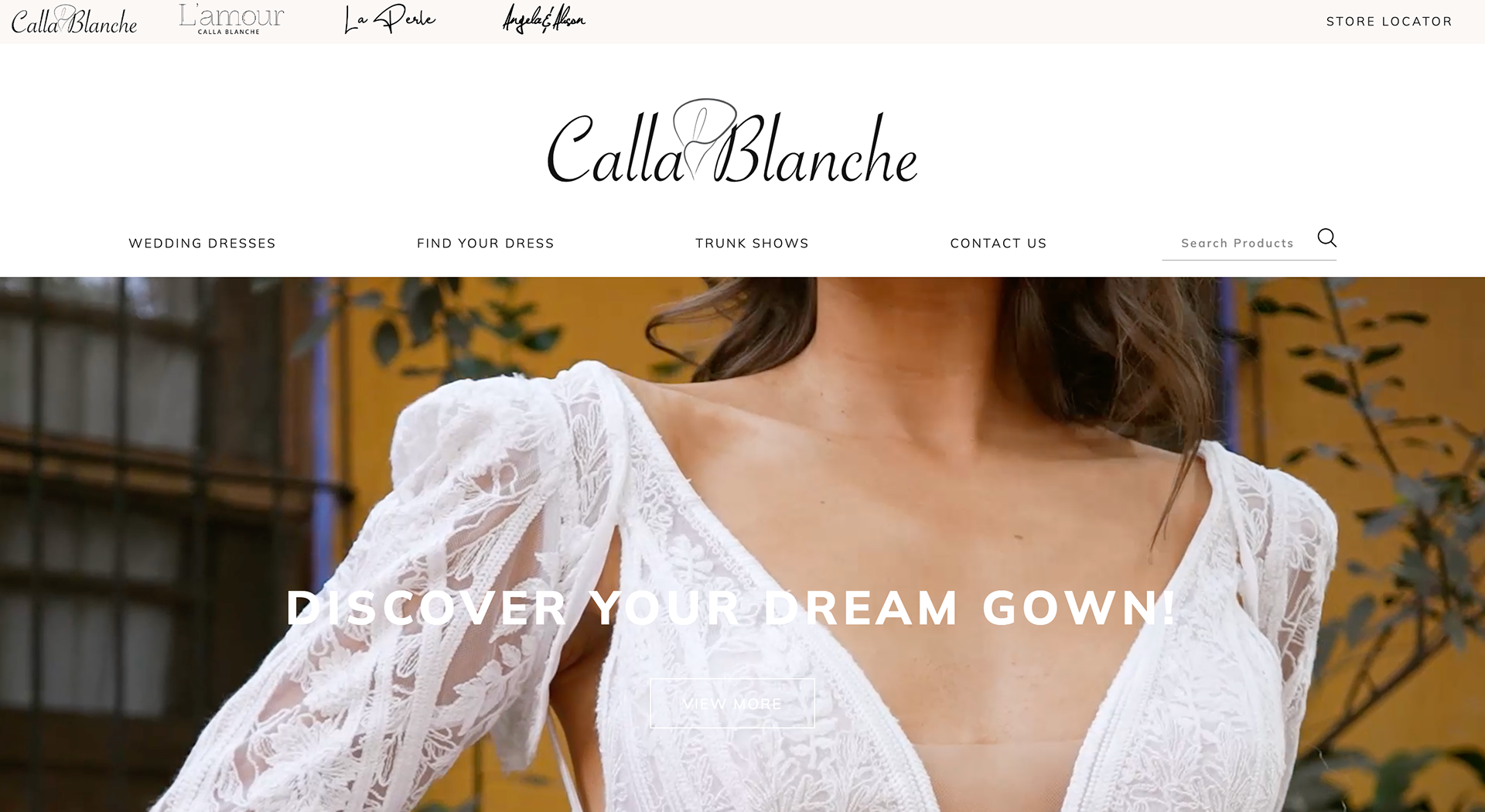
Home Page
The Home Page redesign for Calla Blanche focused on transforming it into a more informative and engaging gateway to the site. Previously sparse, the updated home page now includes links and awareness to various key areas of the website.
In addition to showcasing new arrivals, I added trend call-outs that lead to the dress search page, following SEO best practices to drive traffic. The conversion-focused store locator was also highlighted, along with best sellers, or "Bride Favourites," to guide visitors toward popular styles. An SEO-optimized company description was introduced to improve brand visibility, and a clear call to action encourages visitors to explore each collection, creating a more dynamic and user-friendly experience.
Brand Pages
The Brand Pages were updated following similar best practices used in the website's Home Page redesign. These pages were enhanced with SEO-friendly content, including keyword-optimized descriptions and trend call-outs that direct users to relevant dress search results.
Like the Home Page, links to key sections such as New Arrivals and Best Sellers were added to improve navigation, while conversion-driven elements like the store locator were featured more prominently. By aligning the brand pages with the overall site’s SEO strategy and user-focused design, the updates ensure a cohesive and engaging browsing experience for visitors across all pages.
Website Menus
The new website menu received a major revamp, focusing on both user experience and SEO optimization. While still highlighting areas like New Arrivals and Best Sellers, the main menu was overhauled with SEO best practices in mind. We changed the main menu name from "Collections" to "Wedding Dresses" to align with popular search terms and added links to popular search results, making it easier for brides to navigate the site.
Unnecessary menu items were removed to streamline the navigation, and the store locator was rebranded with a clear call to action. In Phase 2, we plan to introduce additional menu items as new pages are created, including a Bride Feature page. Visit callablanche.com to see future phases as they are implemented.
Product Page
The Product Page redesign introduced several important updates to enhance both user experience and SEO. The layout was revamped to present images and product information more clearly, with key product features now linking directly to the dress search page for seamless product discovery and navigation.
The brand is prominently displayed, and the page includes both a short, SEO-optimized title and a longer description, both developed using keyword research. For ease of use, product details and descriptions are now collapsible, streamlining the browsing experience. A new disclaimer was added to clarify that not all styles are available at every retailer, addressing a common misunderstanding among brides. Finally, the "You May Also Like" section was updated to provide more accurate and relevant style suggestions for customers.
Store Locator
The Store Locator page received several key updates to enhance its functionality and user experience. An icon was added to store results to highlight retailers currently hosting a trunk show, making it easy for brides to find events near them. Additionally, search results now include direct links to relevant sections of the website, providing a more seamless browsing experience.
We also introduced the ability to select multiple brands when searching for retailers, allowing customers to find stores that carry the specific lines they're interested in, streamlining the shopping experience.
Blog Page
The blog page underwent a complete design overhaul to improve user experience and engagement. The new layout features a prominently displayed blog post at the top, ensuring that high-priority content receives the attention it deserves.
Additionally, I implemented a sidebar with article categories, allowing visitors to easily navigate through different topics of interest. This new structure not only enhances the visual appeal of the page but also improves usability, making it simpler for readers to find relevant content and encouraging them to spend more time exploring the blog.
Dress Search
As part of the Calla Blanche website redesign, the dress search page underwent key improvements to enhance both usability and SEO. Image responsiveness was optimized to ensure that visuals display flawlessly across all devices, giving brides a seamless browsing experience.
Additionally, we incorporated brand-specific details and optimized SEO elements, including meta titles and descriptions, directly within the search results. These changes not only improve the user experience but also increase the site’s visibility and relevance in search engine rankings.
Trunk Shows
For the Trunk Shows page redesign, several key changes were implemented to improve functionality and clarity for users. A detailed description was added to explain what a trunk show is, making the concept more accessible to new brides unfamiliar with the term.
The page was also updated with a consistent visual design, creating a cohesive and professional look. To enhance usability, I introduced the ability to sort trunk shows by location and added options for users to view upcoming events through either a map or calendar view, making it easier for brides to find shows near them.
Contact Us
The Contact Us page received a complete visual overhaul, with a fresh design that is more visually appealing and user-friendly. In addition to this aesthetic upgrade, a dedicated form was created specifically for potential retailers, separate from the general inquiries. This new feature helps to nurture leads more effectively and provides valuable marketing insights by gathering detailed information from prospective retail partners. The redesigned page not only enhances user engagement but also supports the brand's growth by streamlining communication and improving lead management.
What about the results?
You're probably saying to yourself, well that's nice and everything but what about the hard numbers? I get it! Although I am not allowed to share specific numbers regarding traffic volume and conversions, below is a screenshot take from Google Analytics depicting the increase across major key metrics since the launch of the new website (6 months of data) compared to the same time period the previous year.
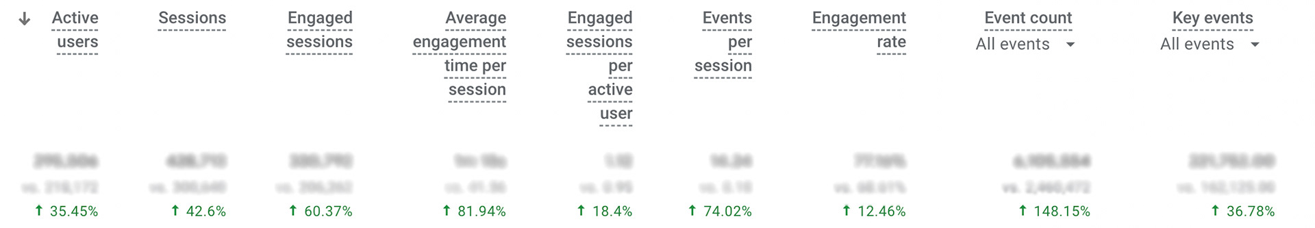
So What?
As you can see, the increase in all major website metrics, from user engagement to overall traffic, directly reflects the strategic changes made during the website overhaul. These improvements, such as enhanced SEO practices, streamlined navigation, and user-friendly design elements, have contributed to higher search engine rankings and better user experiences. The significant rise in key performance indicators—such as page views, session duration, and conversion rates—demonstrates the positive impact of these updates, validating the importance of a well-optimized, visually appealing, and accessible website for driving business growth.
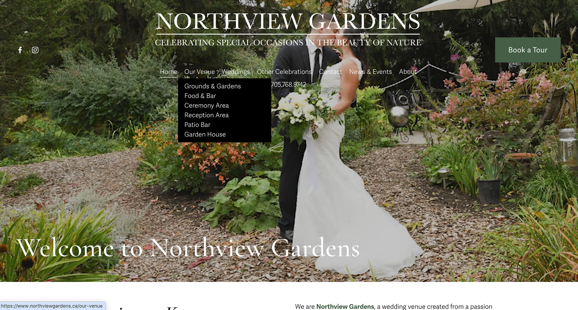
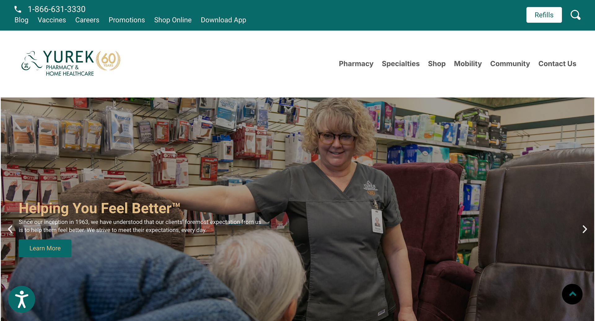
Other website redesign projects I've managed include northviewgardens.ca and yurekpharmacy.com
Have I missed something?
If you didn't see what you wanted to see on this page, or have any questions, I'd be more than happy to share any additional information regarding my experience.
All you need to do is send me an email and I'll respond ASAP!
Note: You will notice that many of the examples come from one company. This reflects the availability of documented work rather than the breadth of my experience. I have worked with multiple clients across different sectors and bring a wealth of knowledge and tailored strategies to each project.